02 · B2B SaaS · Property Operations
· 7 min readProperty maintenance across four roles
Connecting tenants, property managers, owners and trade providers through one shared maintenance workflow.
Role
UX Designer
Company
JRC Software
Product
B2B property-maintenance platform
Timeline
August 2019–February 2021
Users
Property managers · Tenants · Property owners · Trade providers
Platforms
Responsive web and mobile
Scope
Four modules · 70+ responsive screens · 15+ features delivered
Status
15+ features delivered
01 · A maintenance request rarely belongs to one person
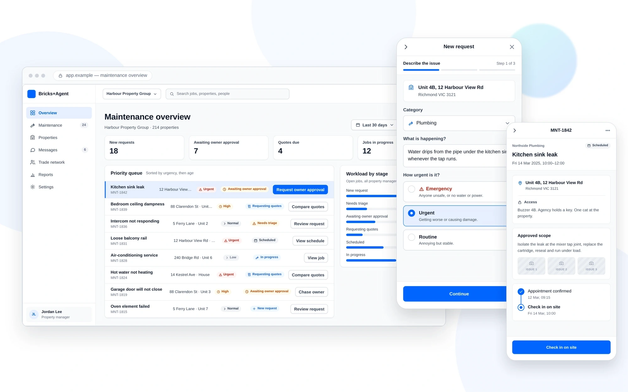
Property maintenance is not a single-user task. A tenant reports the issue, a property manager works out what should happen next, an owner may need to approve the cost, and a trade provider quotes, schedules and completes the work.
Each person sees a different part of the job. The product still has to keep the request, its status and the next action clear as responsibility moves between them.
At JRC Software, I worked on a responsive property-maintenance platform within the PropTech Labs ecosystem. My focus covered four B2B modules and the workflows connecting them.
02 · The difficult part was the handoff
A maintenance job could move through several people before it was complete. Each role needed different information and controls, but everyone had to understand the same job status.
Adding more information was not the answer. The design needed to show the right detail at the right moment without hiding important history, approvals or outstanding actions.
- Request
- Triage
- Owner approval
- Quotes
- Schedule
- Work
- Invoice
- Completed
The workflow became the shared structure behind the four modules. Each role entered and left at different points, while the underlying job record stayed connected.
03 · Four roles, four different needs
Responsibility for a single job was split across four groups of people, each working with a different level of detail.
Tenant
- Report the problem clearly
- Add photographs or supporting details
- Explain property-access requirements
- Track what happens next
Property manager
- Review and prioritise incoming requests
- Route work to the appropriate people
- Coordinate approvals and quotes
- Keep the job moving
Property owner
- Understand the issue and proposed cost
- Review enough context to make a decision
- Approve or decline without entering the complete operational workspace
Trade provider
- Review the job scope
- Submit a quote and availability
- Schedule and complete the work
- Add evidence and invoice information
The interfaces did not need to look identical. They needed to describe the same maintenance job consistently.
04 · From early concepts to developer handoff
I independently led UX design across four product modules. The work included mapping workflows, reorganising page structures, creating wireframes, exploring responsive behaviour and developing approved directions into interactive prototypes and final UI.
Eight concepts were evaluated before development. I worked with business stakeholders and developers to clarify requirements, review feasibility and support 15+ features through delivery.
- Workflow mapping
- Information architecture
- Responsive wireframes
- Interactive prototypes
- UI design
- Reusable patterns
- Developer handoff
- Implementation reviews
05 · The queue had to answer “what needs me now?”
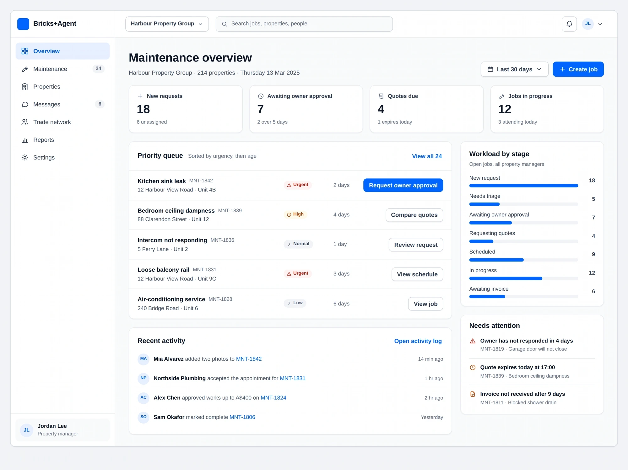
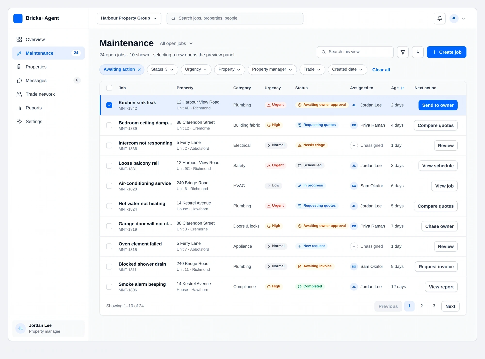
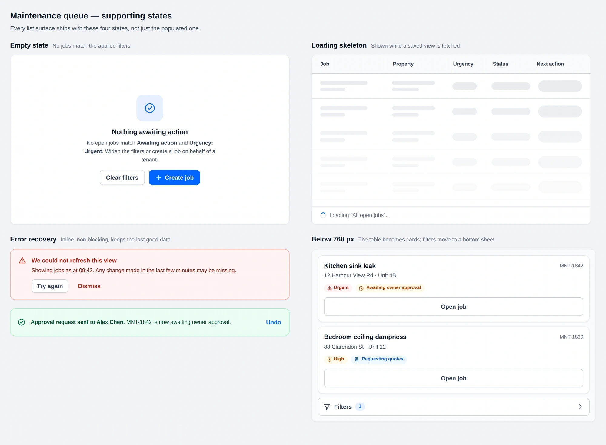
Property managers needed to scan many requests without opening every job. The maintenance queue brought the most useful information forward: issue type, property, current status, urgency and ownership.
Filters and status labels helped narrow the workload. The primary action changed with the job’s stage instead of presenting every possible action at once.
- Status remains visible while scanning.
- Important actions sit close to the relevant job.
- Secondary information stays available without dominating the queue.
06 · The job stayed connected as responsibility changed
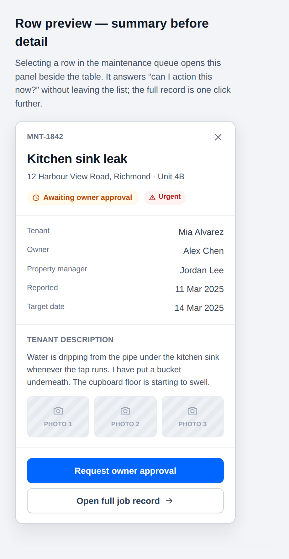
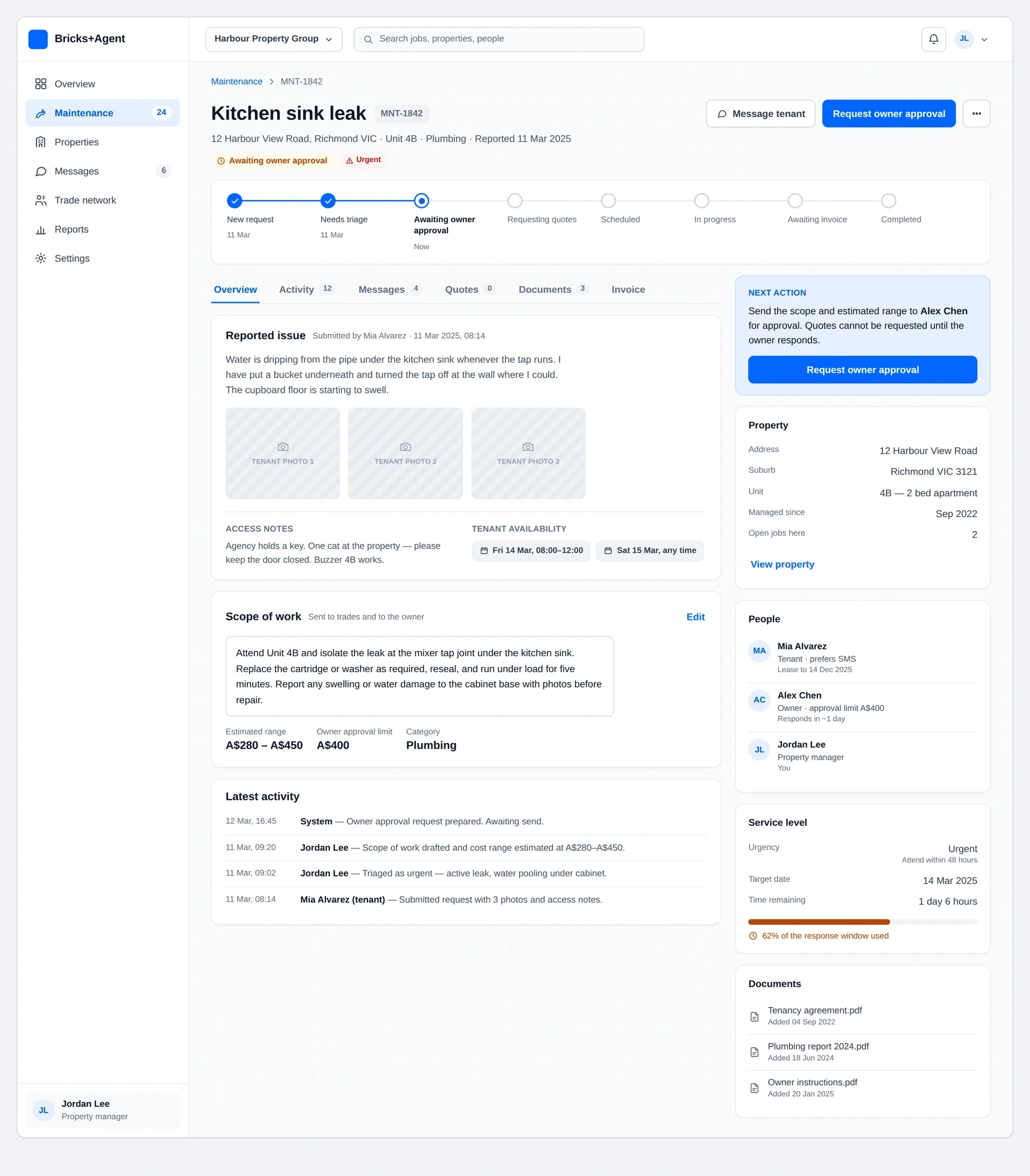
The job-detail structure became the common reference across the experience. It brought the request, property information, updates, files, quotes and next action into one place.
Property managers saw the operational view. Owners received the decision context they needed. Tenants could follow progress without seeing internal details, while trade providers received the scope and access information required to complete the work.
This reduced the need for each module to explain the same job differently.
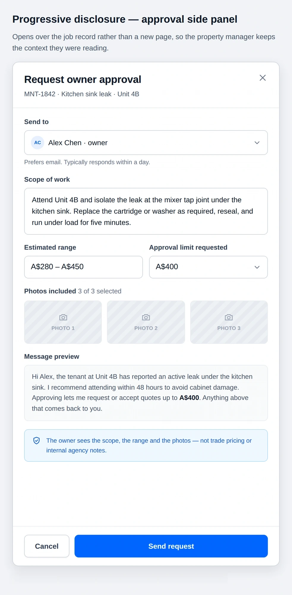
The owner view carried the decision, not the operations
Owners did not need the complete operational workspace. Their view brought together the issue, proposed work, quote details and decision while keeping internal property-management activity out of the way.
07 · Price was only one part of the decision
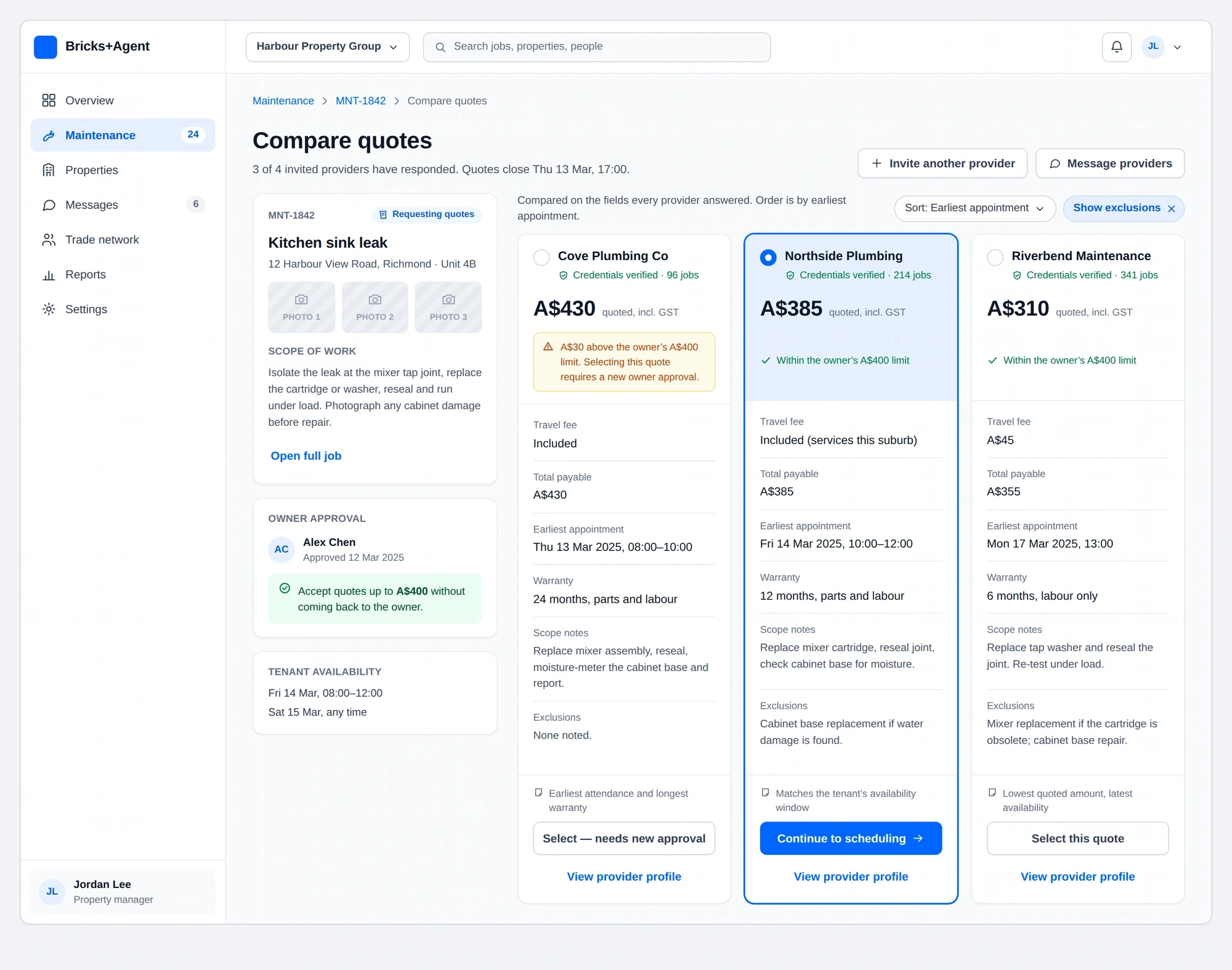
A quote needed to remain connected to the original request. The comparison view kept scope, cost, availability and supporting details together so property managers and owners could understand what they were approving.
The selected direction avoided turning quotes into isolated price cards. Important differences stayed visible, and users could return to the job without losing their place.
08 · The provider decision stayed connected to the job
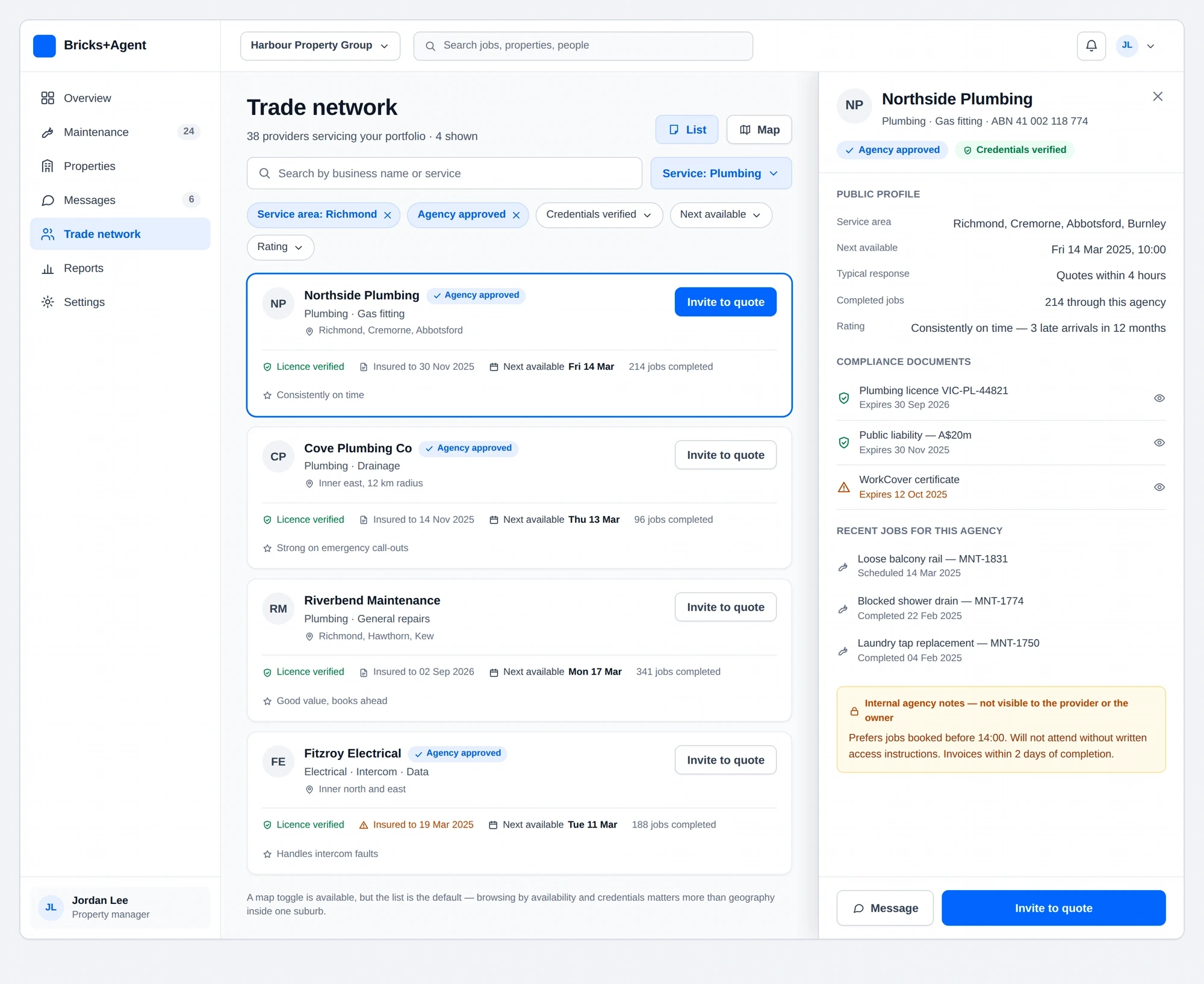
Property managers needed a practical way to review available trade providers without separating that decision from the maintenance request. The interface kept trade information, availability and assignment actions close to the job.
For trade providers, the experience still needed to support work away from a desk. Responsive patterns prioritised the current job, its requirements and the action needed next.
- Keep job context visible during assignment.
- Bring relevant provider information forward.
- Make the next action clear.
- Avoid sending users into a disconnected administrative tool.
09 · Consistency mattered because the roles overlapped
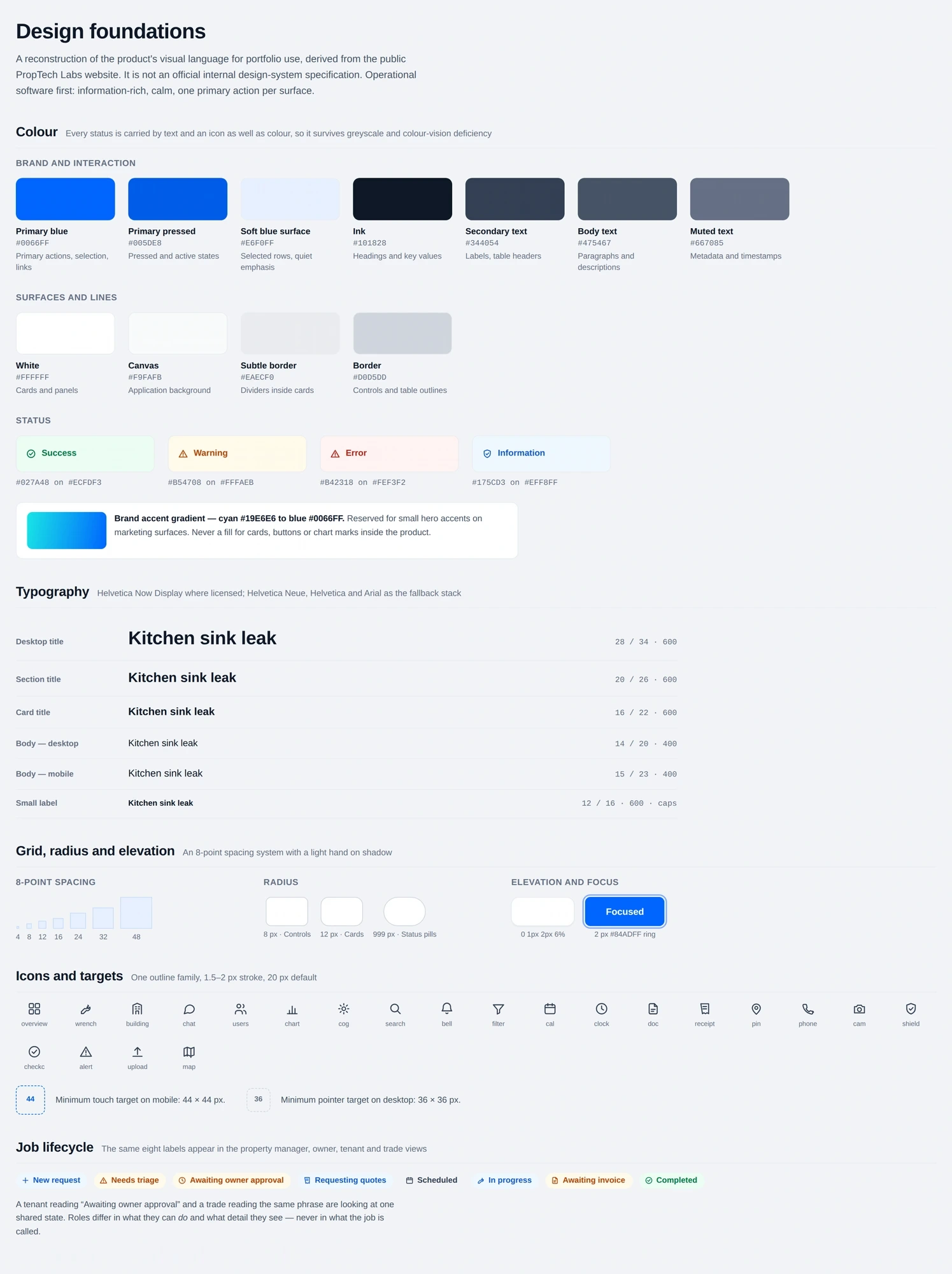
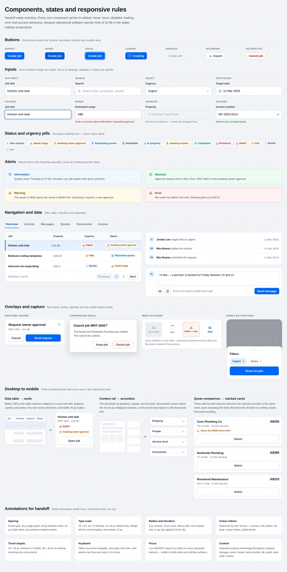
The same concepts appeared throughout the platform: status, priority, properties, people, quotes, approvals, documents and job history. Reusable components helped those ideas behave consistently across desktop and mobile.
The project needed more than a collection of finished screens. Shared foundations helped forms, actions and job information follow the same rules across four modules.
I worked through the states each pattern needed rather than designing only the ideal path. This included active, pending, approved, declined, completed, empty and validation states where relevant.
These were project-level design foundations and reusable interface patterns, not a formally published company-wide design system.
10 · The risky decisions were checked before development
Eight product concepts were evaluated through workflow reviews, wireframes and interactive prototypes before development. This helped expose unclear actions, missing states and responsive problems while they were still easier to change.
The selected directions grew into more than 70 responsive screens. I stayed involved during implementation, answering design questions and reviewing how layouts and interactions translated into the product.
11 · What the work produced
4
B2B product modules owned
70+
Responsive screens designed
8
Concepts evaluated before development
15+
Features supported through delivery
The work gave the four roles a clearer way to move through the same maintenance process. Navigation and page structures were simplified, important actions became easier to locate, and responsive patterns gave the team a more consistent foundation for new screens.
These are delivery outputs and observed design improvements rather than measured business outcomes.
12 · What I carried forward
Multi-role software becomes difficult when every screen explains the workflow differently. The most useful design decision was treating the maintenance job as one connected record, then giving each role the view and actions appropriate to them.
This project also changed how I approach responsive design. A desktop workflow should not simply be compressed for mobile. The hierarchy has to be reconsidered around where the user is and what they are trying to do at that moment.
Different roles. One job. A shared understanding of what happens next.