03 · B2B2C SaaS · Embedded Insurance · Claims Operations
· 7 min readEmbedded protection and claims
A B2B2C service across retail checkout, customer claims and internal claims operations.
As a freelance Product Designer on an engagement delivered through Virtusa, I helped a confidential UK insurance client design an embedded protection and claims service. It connects retail checkout, customer claims and internal claims operations. Phase 1 reached pilot release through a UK electronics retail partner in 24 weeks, and Phase 2 was in final production hardening.
The client's identity and some interface details are withheld under NDA. The end client is referred to throughout as "a UK gadget and electronics insurance provider." Some visuals are anonymized or rebuilt for this write-up; the research, decisions and delivery record are from the original project.
Role
Freelance Product Designer · one of two designers on a twelve-person delivery team
Engagement
Delivered through Virtusa
Client
Confidential UK insurance client
Product
Embedded protection and claims platform
Team
Product Owner · 2 Product Designers · 6 Developers · 3 QA Engineers; client-side Compliance and Claims stakeholders joined at key decision points
Timeline
24 weeks to Phase 1 pilot release · Phase 2 in final production hardening
Pilot snapshot
1,842 eligible checkout sessions · 132 active protection selections · 18 claims filed · 15 completed without customer-support intervention
AI in the workflow
Claude reviewed my interview guide. Claude Code helped map edge cases, generate design tokens and draft the first handoff documentation. Cursor helped me turn approved flows into interactive prototypes. I reviewed, edited or rejected every output before it influenced the product.
Context
The project started with a commercial goal: increase protection adoption. Research pushed us toward a broader question — could we keep the same level of clarity from the first offer through to a resolved claim?
01 · The brief sounded simpler than the service
The client wanted to help mid-market retailers offer protection for eligible electronics and appliances without building the insurance infrastructure themselves.
From the retailer's point of view, this appeared to be a checkout feature. From the customer's point of view, it could become a relationship lasting months. Behind it sat policy creation, evidence collection, claims assessment, communication, audit history and support.
My working question became: How might we help shoppers make an informed choice, recover confidently when something goes wrong and give claims teams enough context to resolve cases fairly?
02 · Research moved the centre of the problem
I spoke with 8 UK online shoppers, 4 retailer product/support/operations professionals and 4 claims or compliance professionals. The work also included competitor and regulatory reviews.
Before the interviews, I used Claude to flag leading, hypothetical and double-barrelled questions. It improved the guide, but it did not touch participant quotations or generate findings. The participant counts, quotations and themes below come from the original research record.
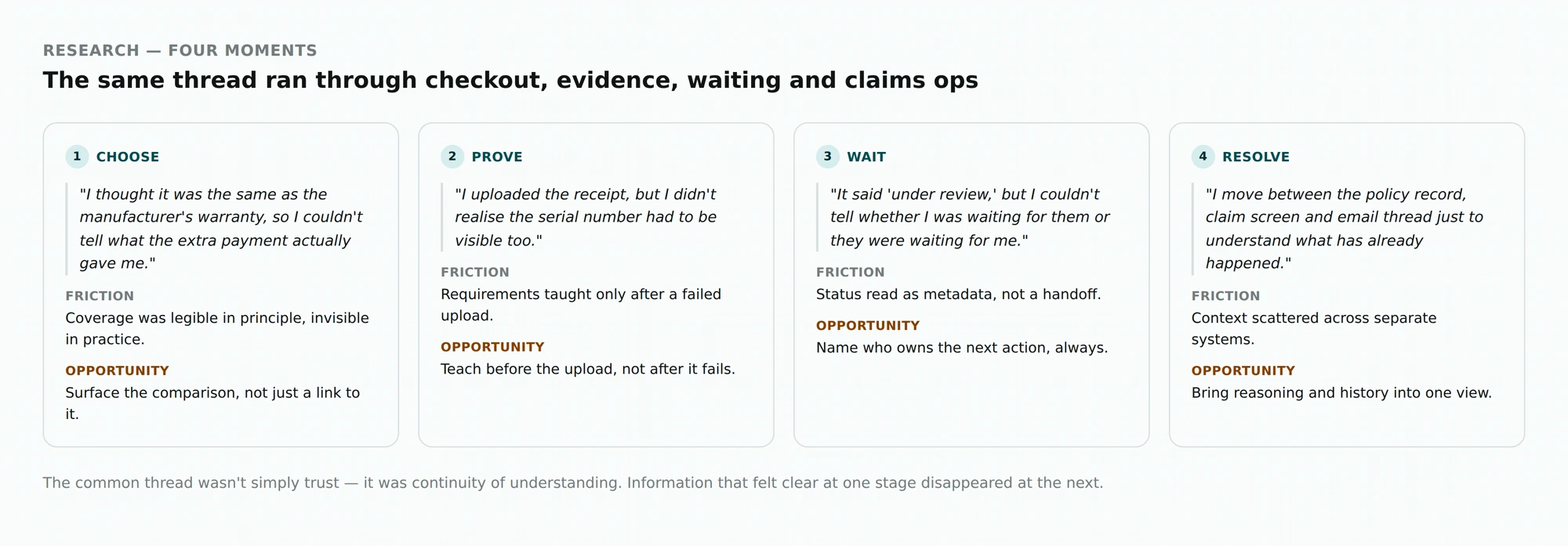
Four moments kept coming up. At checkout: "I thought it was the same as the manufacturer's warranty, so I couldn't tell what the extra payment actually gave me." While providing evidence: "I uploaded the receipt, but I didn't realise the serial number had to be visible too." During the wait: "It said 'under review,' but I couldn't tell whether I was waiting for them or they were waiting for me." Inside claims operations: "I move between the policy record, claim screen and email thread just to understand what has already happened."
The common thread across those moments was continuity of understanding. Information that felt clear at one stage disappeared at the next.
03 · Four principles kept us honest
Make protection understandable before making it persuasive. Never hide the next step. Prevent errors before asking customers to recover from them. Automate repetitive work without hiding consequential decisions.
These were not poster statements. We used them when the team disagreed or when scope became tight.
04 · Checkout — active choice, with enough information to make it
Pre-selection was never an option. FCA ICOBS 6A.2 requires customers to actively elect to obtain a paid optional product. That settled the compliance boundary, but not the experience.
We explored three directions: a completely neutral choice with minimal guidance; a generic "popular choice" badge; and a neutral choice supported by a relevance statement based on the customer's demands-and-needs answers.
I recommended the third. A popularity badge added persuasion without helping someone understand the product. The relevance statement connected the offer to information the customer had actually provided, while the final wording remained subject to compliance approval under the ICOBS 5.2 demands-and-needs requirements.
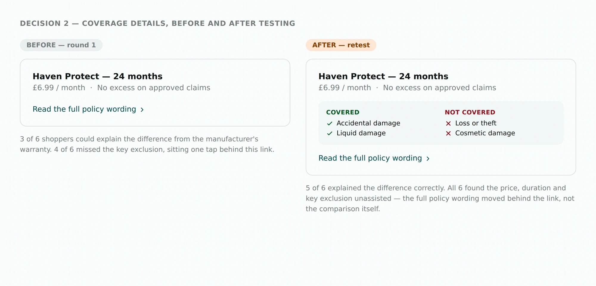
Testing exposed a second problem. The original design technically provided the policy information, but most people did not open it. Only 3 of 6 shoppers could explain how the cover differed from the manufacturer's warranty, and 4 of 6 missed a key exclusion.
So I combined the active choice with a short Covered / Not covered comparison. Full wording remained available as a secondary layer.
Round 2 included six moderated shopper sessions. In that round, 5 of 6 participants explained the difference correctly and all 6 found the price, duration and key exclusion without assistance. During the pilot, analytics recorded 132 active selections from 1,842 eligible sessions — an observed attach rate of 7.2%.
05 · The claim form was teaching too late
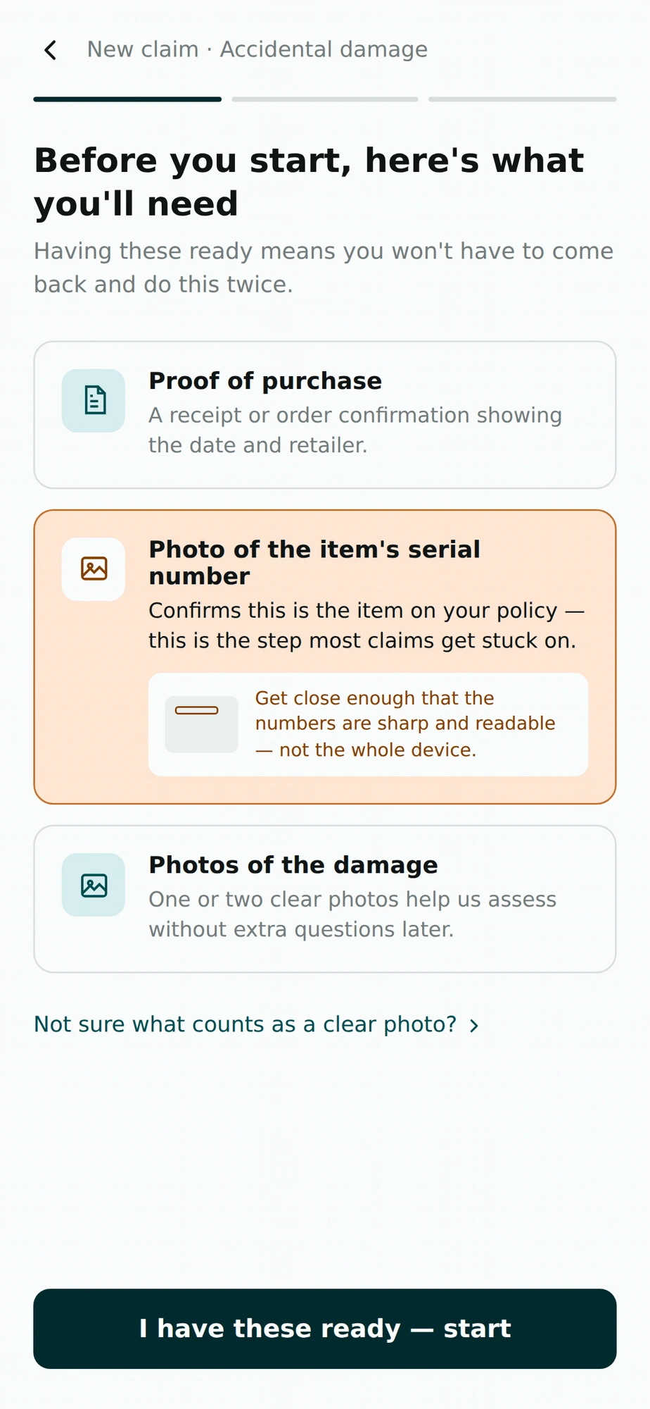
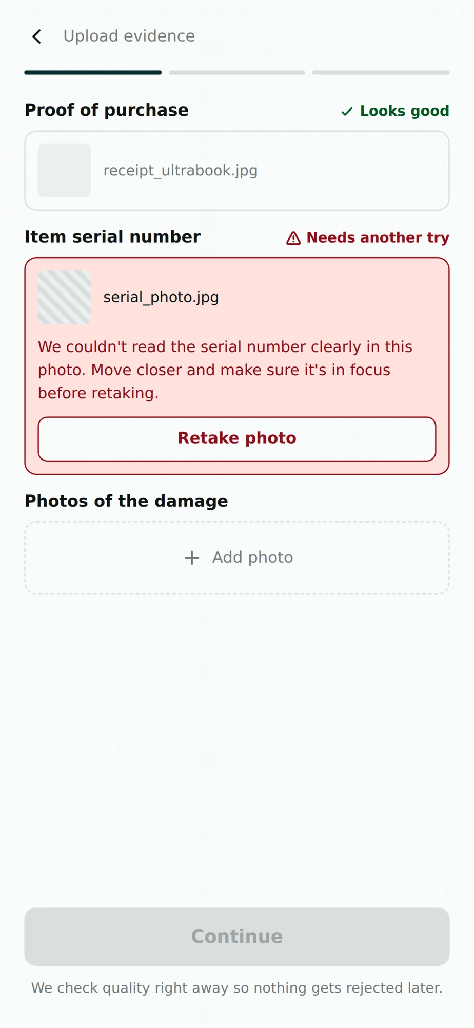
The first flow explained document requirements only after an upload failed. Research had already shown the consequence: customers discovered missing evidence through a later email and had to return to the claim.
The same thing happened in usability testing. Four of 6 shoppers selected an incomplete purchase image or missed the serial-number requirement. Two reached submission before they knew anything was wrong.
I moved the evidence checklist ahead of the form, added annotated examples and reused information the platform already held. File requirements and missing items were surfaced immediately after upload rather than after submission.
Round 2 included six moderated sessions. Five of 6 participants provided everything required on their first attempt, and the sixth corrected the problem without moderator help.
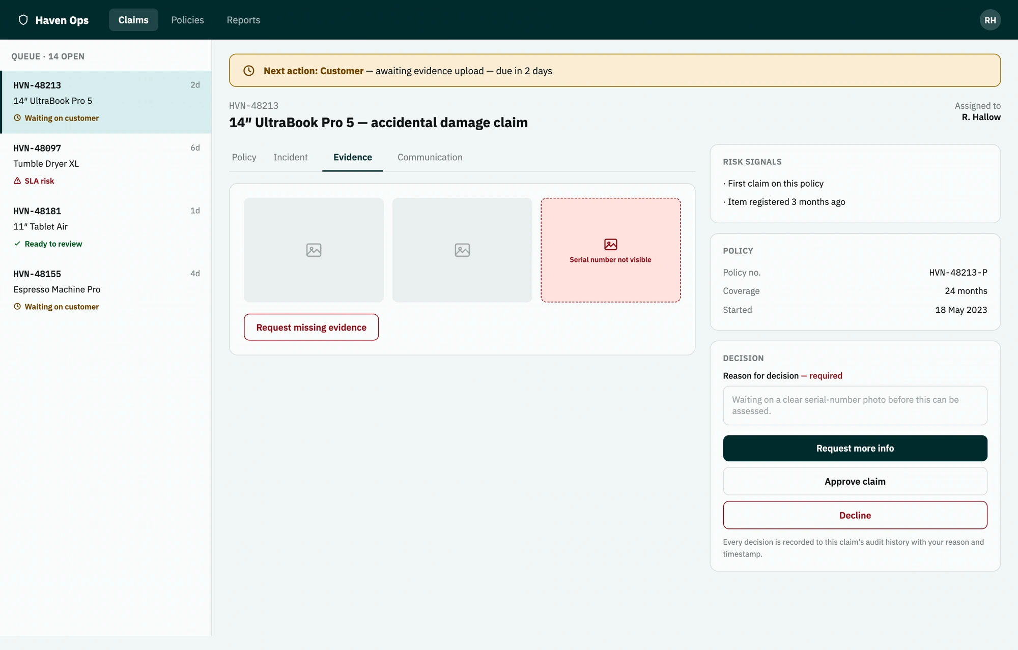
06 · Twenty-two seconds to answer a basic question
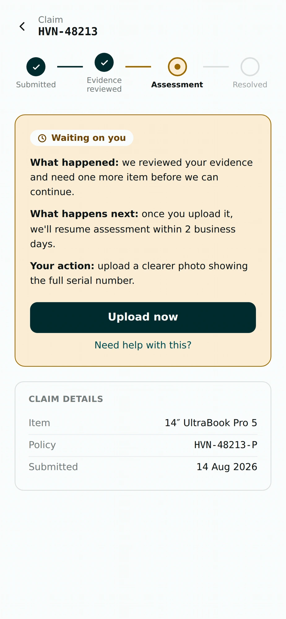
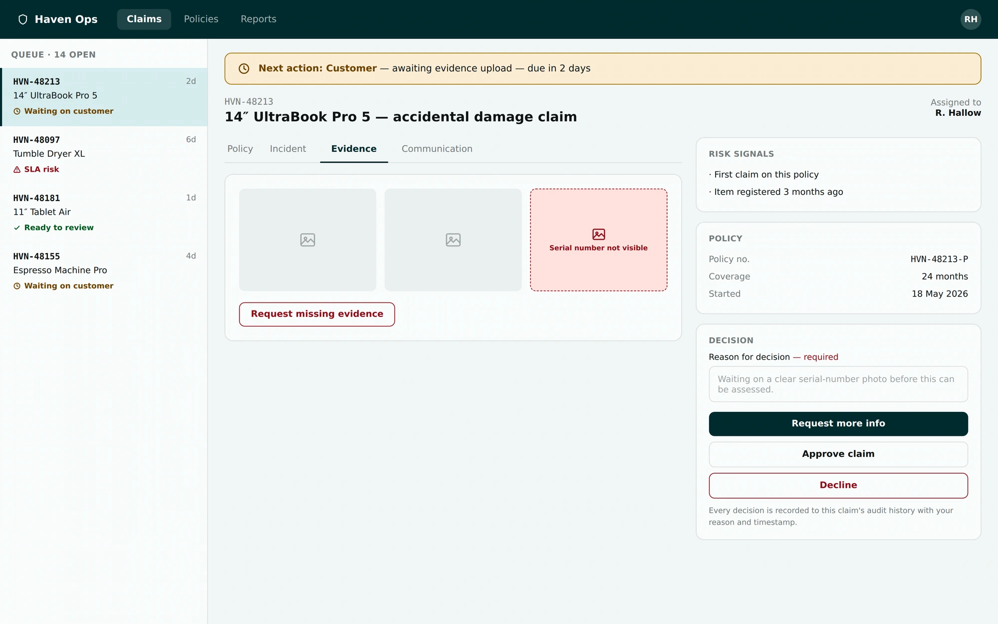
When assessors opened a claim, three of four missed that the next action belonged to the customer. Median time to identify ownership was 22 seconds.
The status label was present. That was the problem: it behaved like metadata when it should have behaved like a handoff.
I replaced it with a persistent banner above the case detail. It named who owned the next action, what needed to happen, and when it was due. The same model appeared in the customer's claim timeline, so both sides saw a consistent version of the handoff.
Round 2 included four moderated assessor sessions. All four identified the correct owner, and median time fell to 7 seconds.
The static Figma frames appeared clear, but once the claim state changed in the browser, the handoff was easy to miss. Testing the flow as a working prototype surfaced that before the implementation was locked.
07 · A claims workshop changed the decision model
The original flow allowed assessors to act quickly, but it did not capture enough reasoning behind consequential decisions.
In a working session, Claims and Compliance stakeholders defined the available actions, which decisions needed sign-off and what had to remain auditable. My job was to turn those operating rules into an interface that assessors could use without slowing every case unnecessarily.
For the pilot, consequential actions required a reason and a confirmation step. The interface also preserved the decision, author, timestamp and related communication in the audit history. Existing permission and approval rules determined which actions each role could complete.
The mechanism shipped with the pilot because it supported review, complaint handling and outcome monitoring from day one.
08 · The scope cut
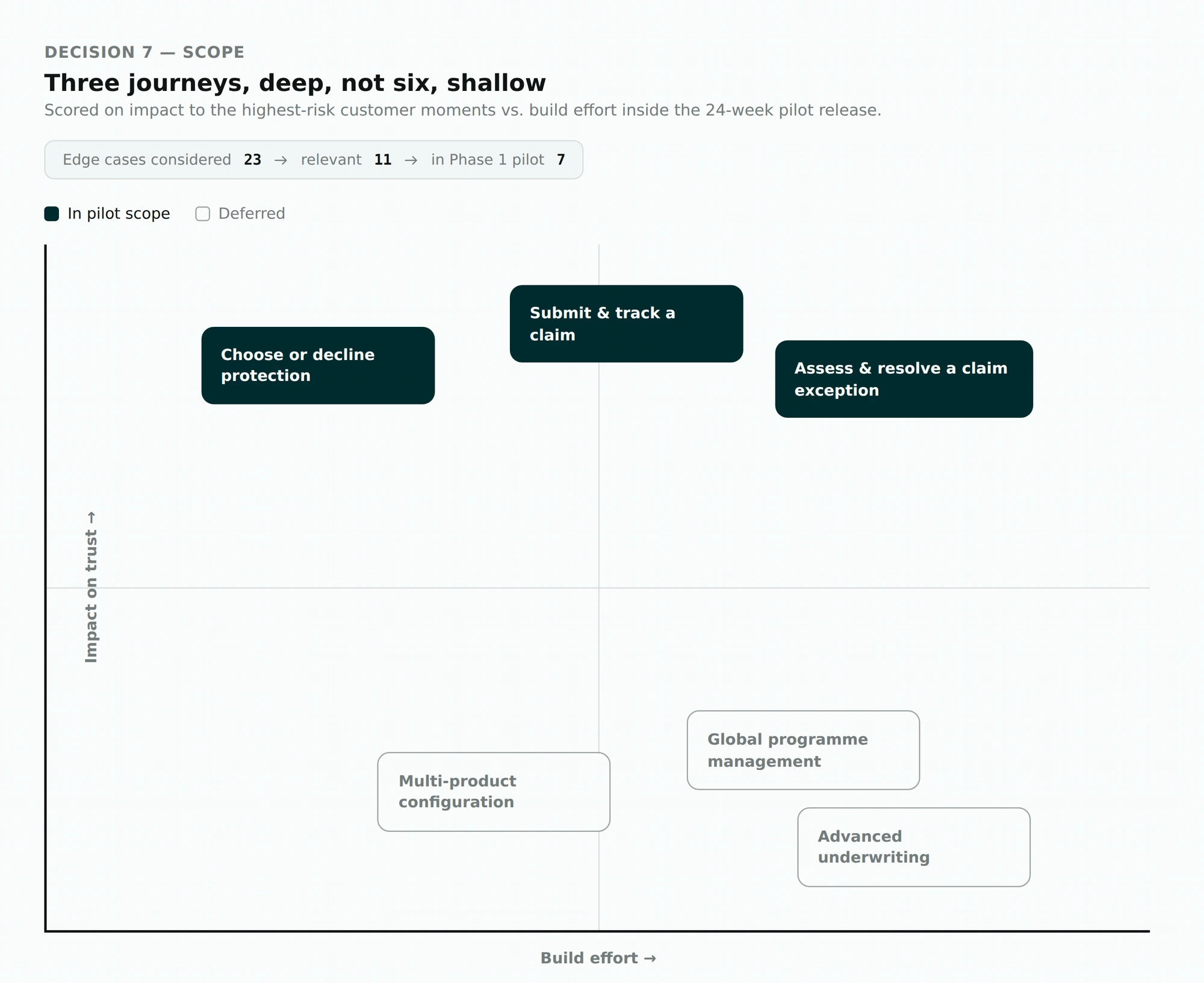
The service blueprint included far more than we could responsibly deliver in one phase: global programme management, advanced underwriting, multi-product configuration and several secondary administrative journeys.
Building only checkout would have been faster. It would also have left the claim and resolution stages — the places where research showed trust breaking — unfinished.
We prioritised three complete journeys instead: choose or decline protection; submit and track a claim; resolve a claim exception.
Claude Code helped turn the approved flows into 23 possible edge cases. I removed scenarios that did not map to credible customer harm, operational cost or regulatory risk. Eleven remained relevant; seven entered the Phase 1 pilot.
That cut kept the 24-week release achievable without reducing the product to a polished checkout demo.
09 · The visual direction needed to work in someone else's brand
This was a white-label product. A strong identity could not come at the cost of competing with the retailer using it.
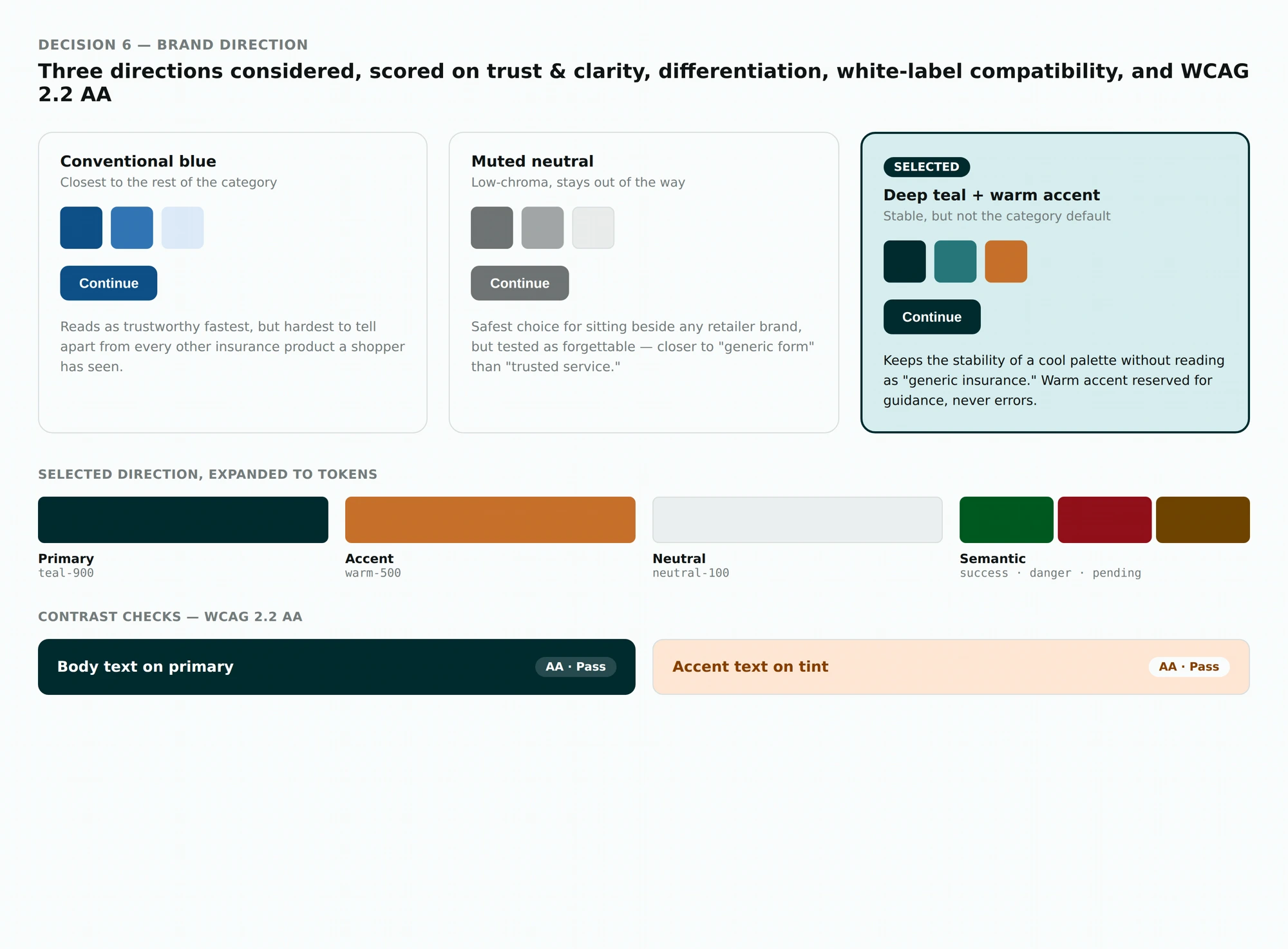
Three directions were considered: conventional blue (familiar within insurance, but hard to distinguish from the competitor set); muted neutral (easy to place beside retailer branding, but too little hierarchy for claims and status-heavy screens); and deep teal with a restrained warm accent (clear hierarchy and flexible white-label use, but required careful control of semantic greens and warnings).
I selected the deep teal direction after testing it across checkout, forms, claims tables and status components. Claude Code converted the palette into token variables, which made it faster to inspect the same colours across multiple surfaces. Automated checks caught failing combinations before high-fidelity handoff.
The warm accent was reserved for guidance and priority moments. Status never depended on colour alone; every state also used text and an icon.
10 · From design files to a build the team could question
I created a focused component system for offer cards, form controls, evidence uploads, claim timelines, tables, filters and decision actions.
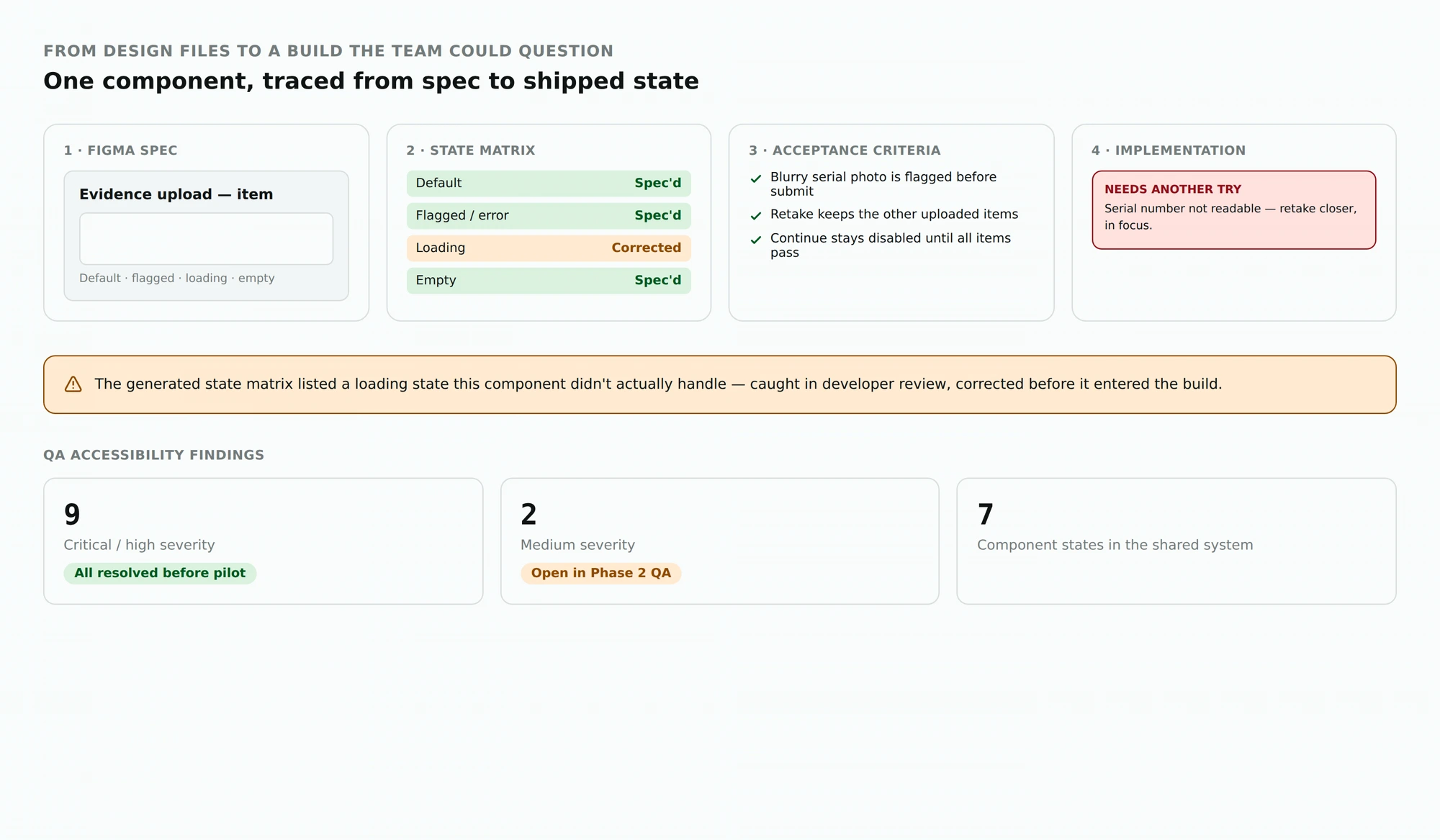
The handoff covered more than the default state: responsive behaviour, roles and permissions, validation and error recovery, loading and empty states, keyboard and focus behaviour, analytics events, and acceptance criteria.
Claude Code drafted the first state matrix and component notes. I reviewed them with developers and corrected gaps before they entered the build. Cursor helped us compare working components against the approved interaction model. One small example: the generated documentation included a loading state the component did not actually handle, which we caught during review rather than after release.
QA recorded nine critical or high-severity accessibility findings. All nine were resolved before the pilot. Two medium-severity issues remained in Phase 2 QA.
11 · What shipped — and what the numbers can support
Phase 1 ran for six weeks through a mid-sized UK electronics retail partner, covering eligible laptops, tablets and small appliances.
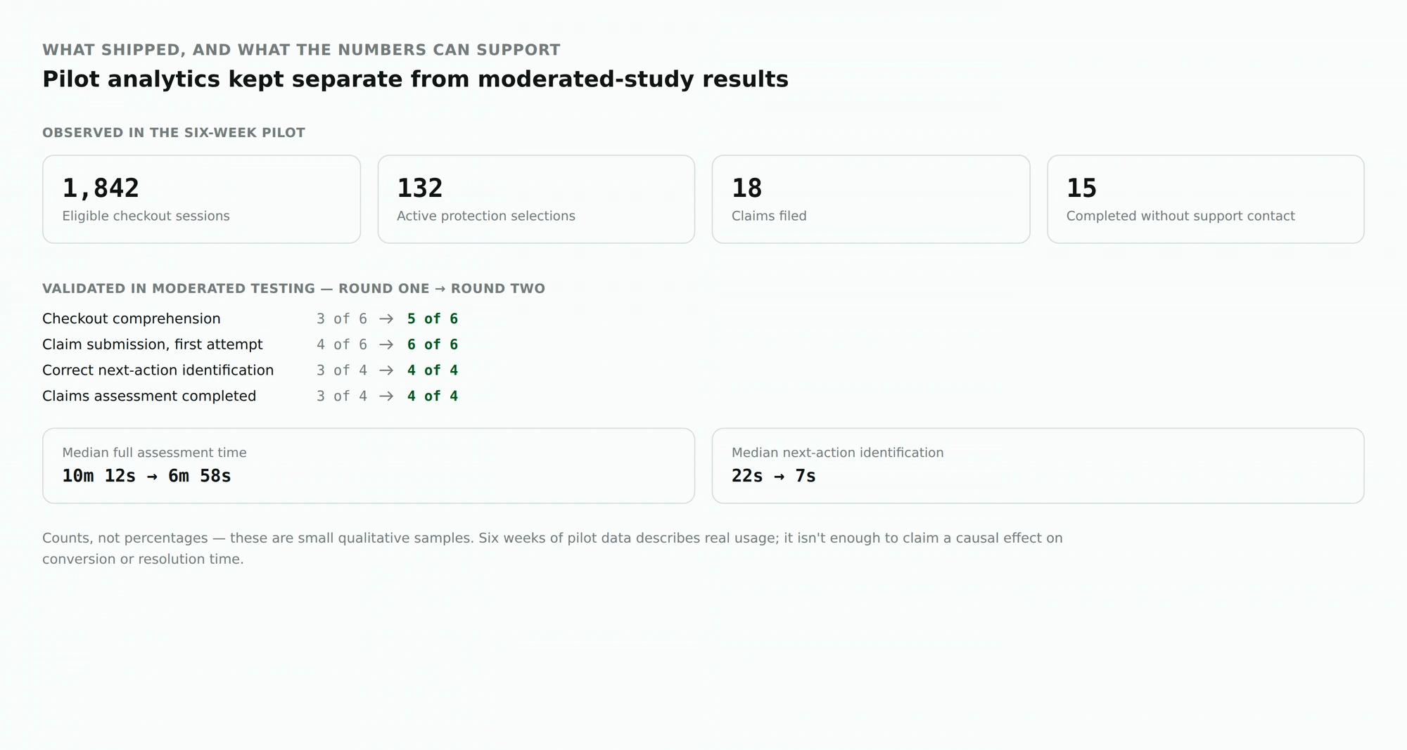
Observed in the pilot: 1,842 eligible checkout sessions · 132 active protection selections · 18 claims filed · 15 completed without customer-support intervention.
Validated in moderated testing: checkout comprehension 3 of 6 → 5 of 6; claim submission 4 of 6 → 6 of 6; correct next-action identification 3 of 4 → 4 of 4; claims assessment completed 3 of 4 → 4 of 4; median full assessment time 10m 12s → 6m 58s; median next-action identification 22s → 7s.
Phase 2 monitoring was set up to examine evidence resubmission, avoidable support contact, service-level breaches, complaint patterns and how the audit trail performed under higher dispute volume.
12 · Looking back
I went into the project thinking the difficult part would be presenting protection at checkout without damaging conversion. That mattered, but it was not the hardest part.
Keeping the promise understandable after the purchase — when a customer had to find a policy, prove what happened, wait for a decision or challenge an outcome — was harder. Working with a coded prototype earlier helped uncover behaviour that static frames hid.
My next focus would be the vulnerable-customer support path and the decision-accountability model once a larger claims sample made those outcomes easier to evaluate.
13 · How I used AI
I used Claude to review interview questions and identify possible edge cases. Claude Code helped draft component documentation, and Cursor helped me test approved flows as working prototypes. I reviewed every output against research, compliance requirements and team decisions before it influenced the product.