01 · B2B SaaS · POS & Payments
· 6 min readCAKE POS
Redesigning ordering and payments across employee and customer screens.
Connecting ordering, checkout and payment across employee- and customer-facing interfaces for restaurants in the United States and Canada.
Role
Product Designer
Company
Mad Mobile — CAKE
Product
B2B restaurant SaaS and POS
Users
Restaurant owners, managers, cashiers, servers and guests
Market
United States and Canada
Scope
Order entry, modifiers, checkout, payments, split payments, voids and refunds, customer-facing display and design system
Team
Product manager, engineers, QA, product designers, design lead, support and implementation
Delivery
15+ core and exception flows · 60+ screens and prototypes · 12+ features delivered across 18 Agile sprints, with product, engineering and QA
Status
Shipped · Phased rollout across the United States and Canada
01 · A routine transaction had become harder than it needed to be
At a busy restaurant counter, one order moves between two screens. An employee builds the order and starts payment. A guest reviews the total, selects a tip, pays and chooses a receipt. If the employee flow is slow, the line grows. If the customer display is unclear, staff have to explain what the screen should have made obvious.
There was no single broken feature. Smaller problems repeated across the transaction: frequent tasks took more steps than employees expected, similar actions behaved differently, and payment status was not always clear across the employee and customer screens.
One example appeared between modifiers and checkout. A required choice could remain unresolved until payment, forcing the employee to leave checkout, reopen the item, complete the choice and return. Each step was simple. Repeating it during a rush was not.
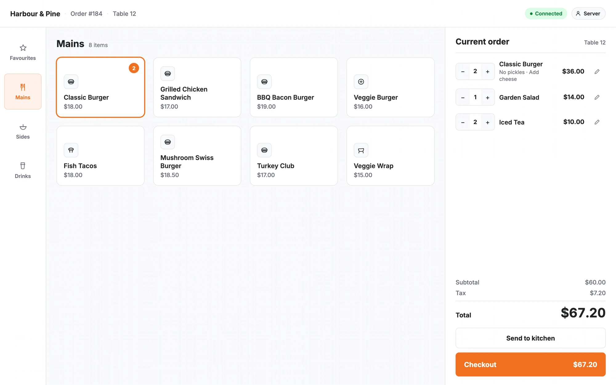
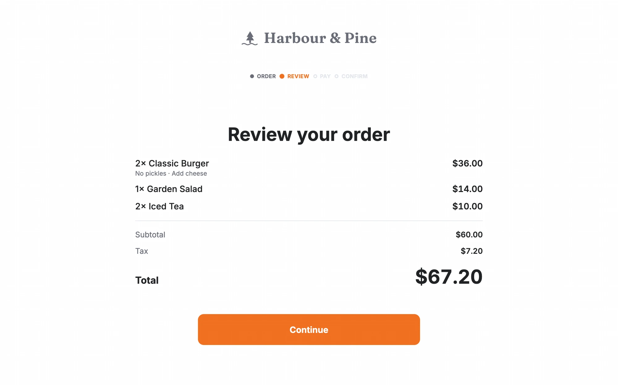
Before
Employee screen
Awaiting payment
Customer display
Item selection
Screens described different moments of the same order.
After
Employee screen
Awaiting payment · Guest reviewing
Customer display
Review your order
Both screens track the same transaction state.
02 · Three people shared the same five minutes
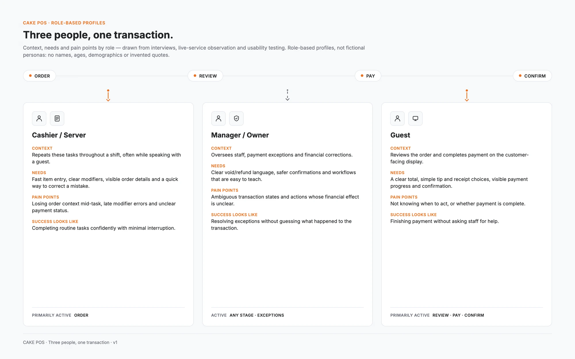
I used role-based profiles because the important difference was not age or personality. It was what each person needed from the same transaction.
- Cashiers and servers needed speed, visible order context and quick correction.
- Managers and owners needed clear financial actions and safer exception handling.
- Guests needed a simple total, payment progress and confirmation without staff assistance.
03 · The research pointed to consistency, not more features
I drew on interviews with owners, managers, cashiers and servers; observation during live restaurant service; usability testing; and recurring feedback from support and implementation teams.
The strongest pattern was not a request for more features. Staff wanted the product to preserve context, catch incomplete choices earlier and make transaction status clear enough that they did not need to stop and double-check what had happened.
Basis: Based on interviews with owners, managers, cashiers and servers, live-service observation, and usability testing with 23 participants.
Claim
Evidence
Keep the active order visible while making changes
Employees paused to re-check the order when it was hidden during modifier configuration.
Surface required and incomplete choices before checkout
Required and optional choices looked nearly identical, so missing required choices went unnoticed until checkout.
Keep the total, amount paid and remaining balance together
Once split payment opened as its own step, the connection to what was already paid became harder to hold onto.
Give matched transaction stages on employee and customer screens
Employee and guest screens didn't always describe the same moment the same way, which read as inconsistency.
04 · Designing one connected transaction
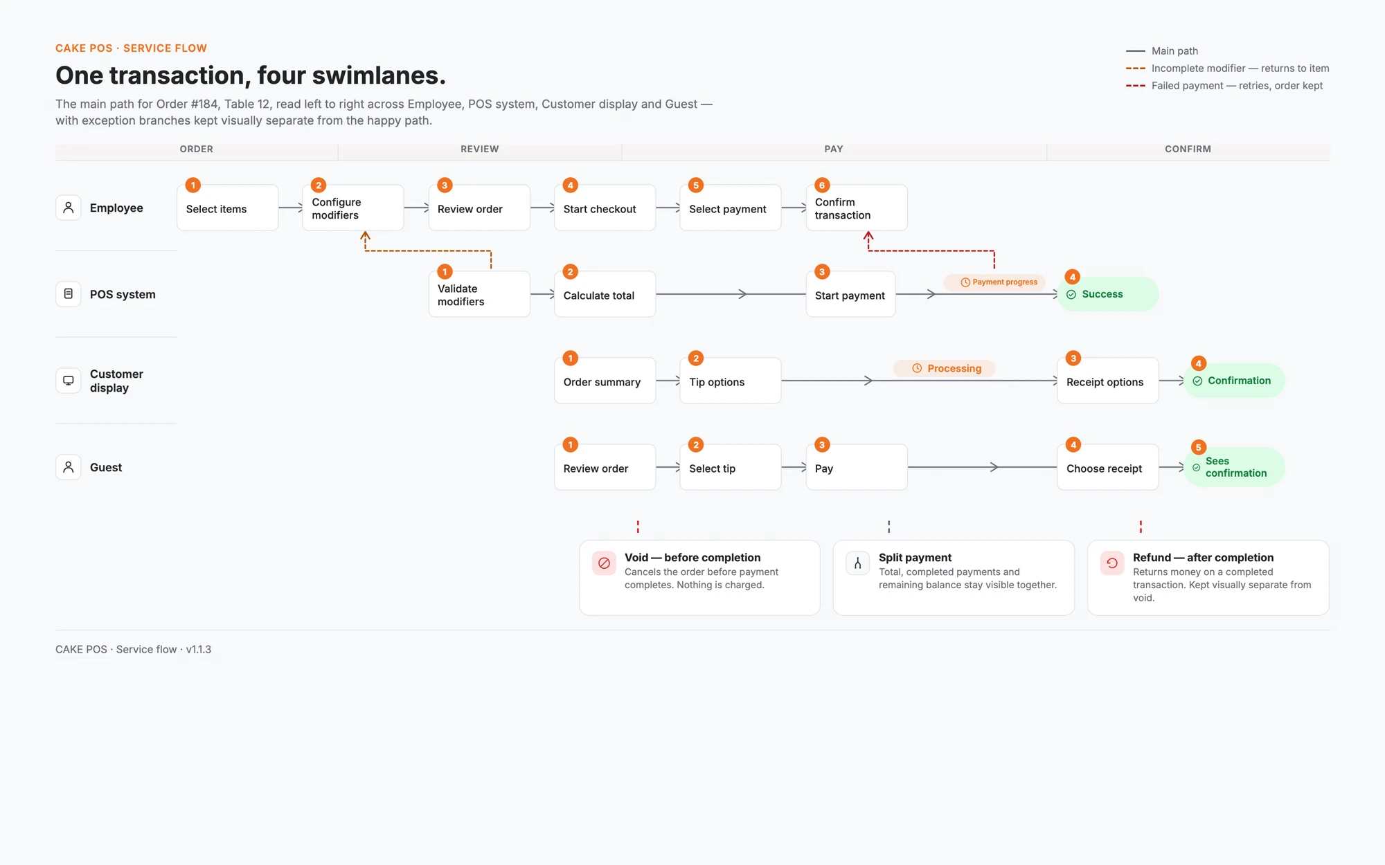
I mapped ordering, checkout and payment as one journey: build order → add modifiers → review → checkout → pay → confirm. Split payments, voids, refunds and payment recovery became branches of that flow. The customer display followed the same transaction from the guest's side.
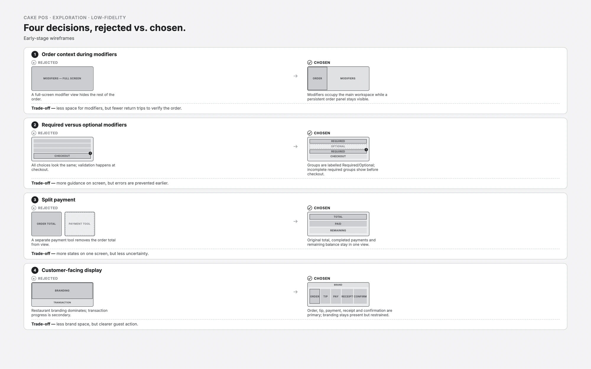
Low-fidelity wireframes let me test the structure before visual polish: could employees configure an item without losing the order, identify required choices, understand what remained during a split and keep the guest informed?
05 · Product decisions and trade-offs
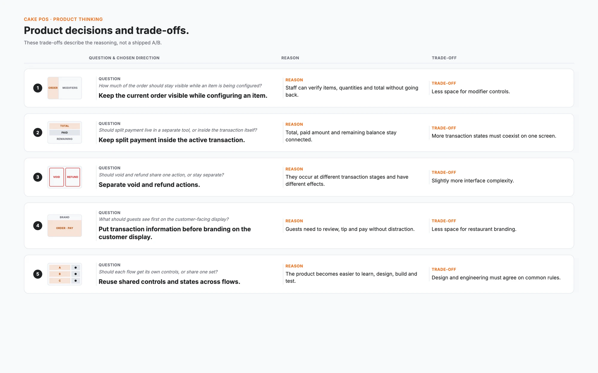
Every decision traded speed against space, safety or implementation cost. Keeping the order visible reduced room for modifiers. Keeping split payment inside the transaction created more states on one screen. Separating void and refund added interface complexity, but made the consequence of each action clearer.
06 · Order entry and modifiers
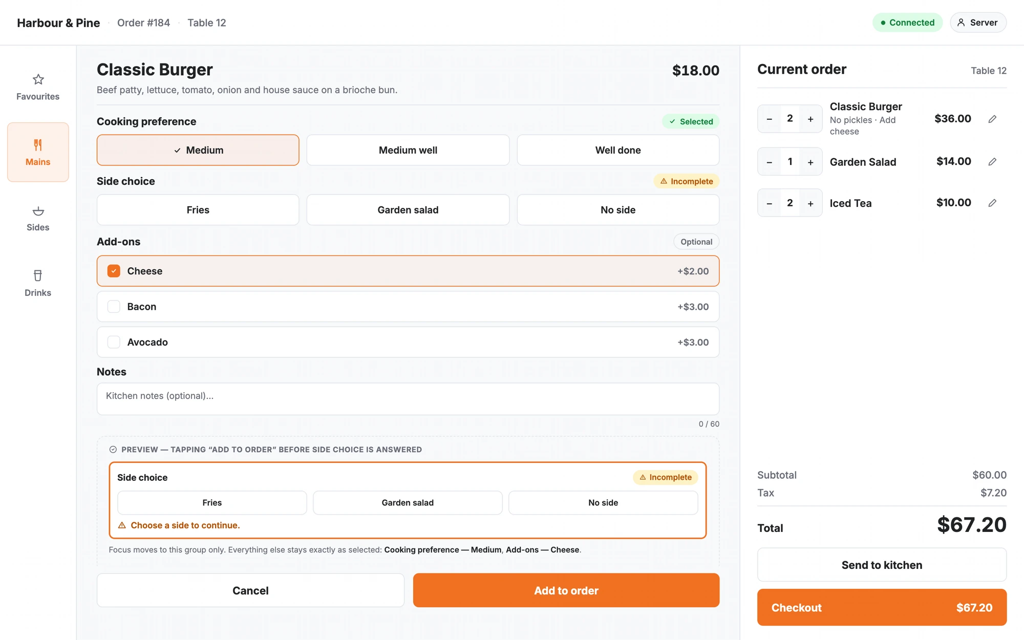
I simplified how employees moved between item selection, modifiers and order review. The active order remained available as context, while modifier groups used consistent selection patterns. Required, optional and incomplete states appeared before checkout instead of becoming a payment-stage surprise.
07 · Checkout, payments and recovery
Routine payment needed to be fast. Split payments and interrupted transactions needed more guidance because uncertainty could lead to duplicate actions, lost context or an incorrect financial correction.
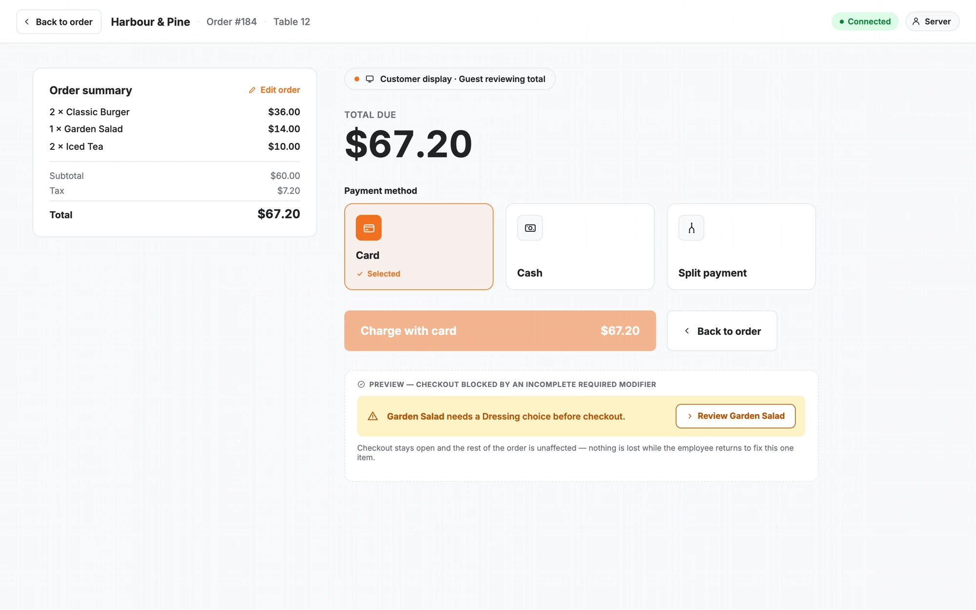
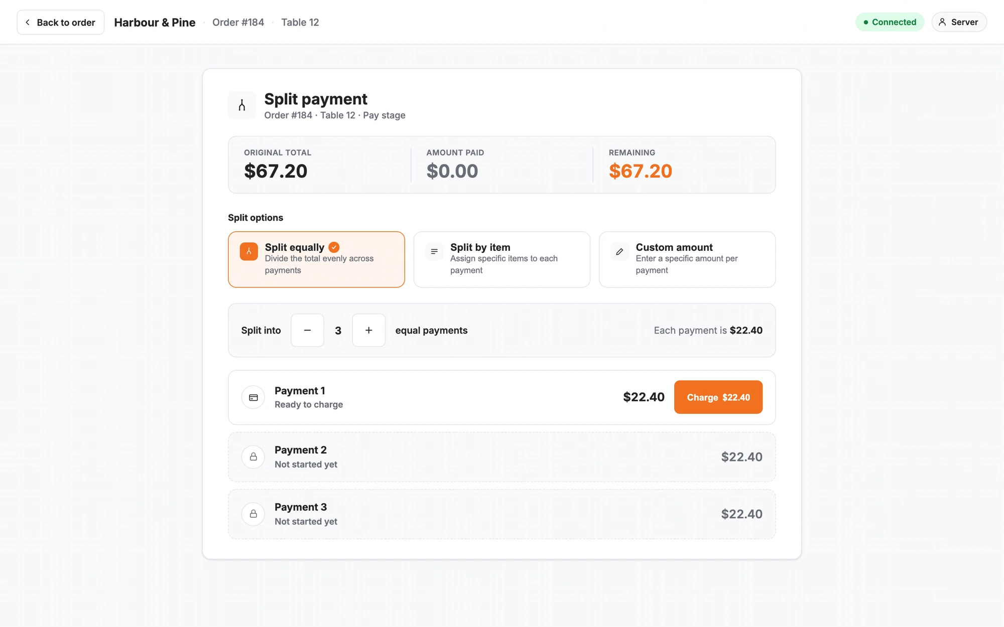
I kept split payment inside the active transaction. The original total, completed payments and remaining balance stayed together instead of moving into a separate tool.
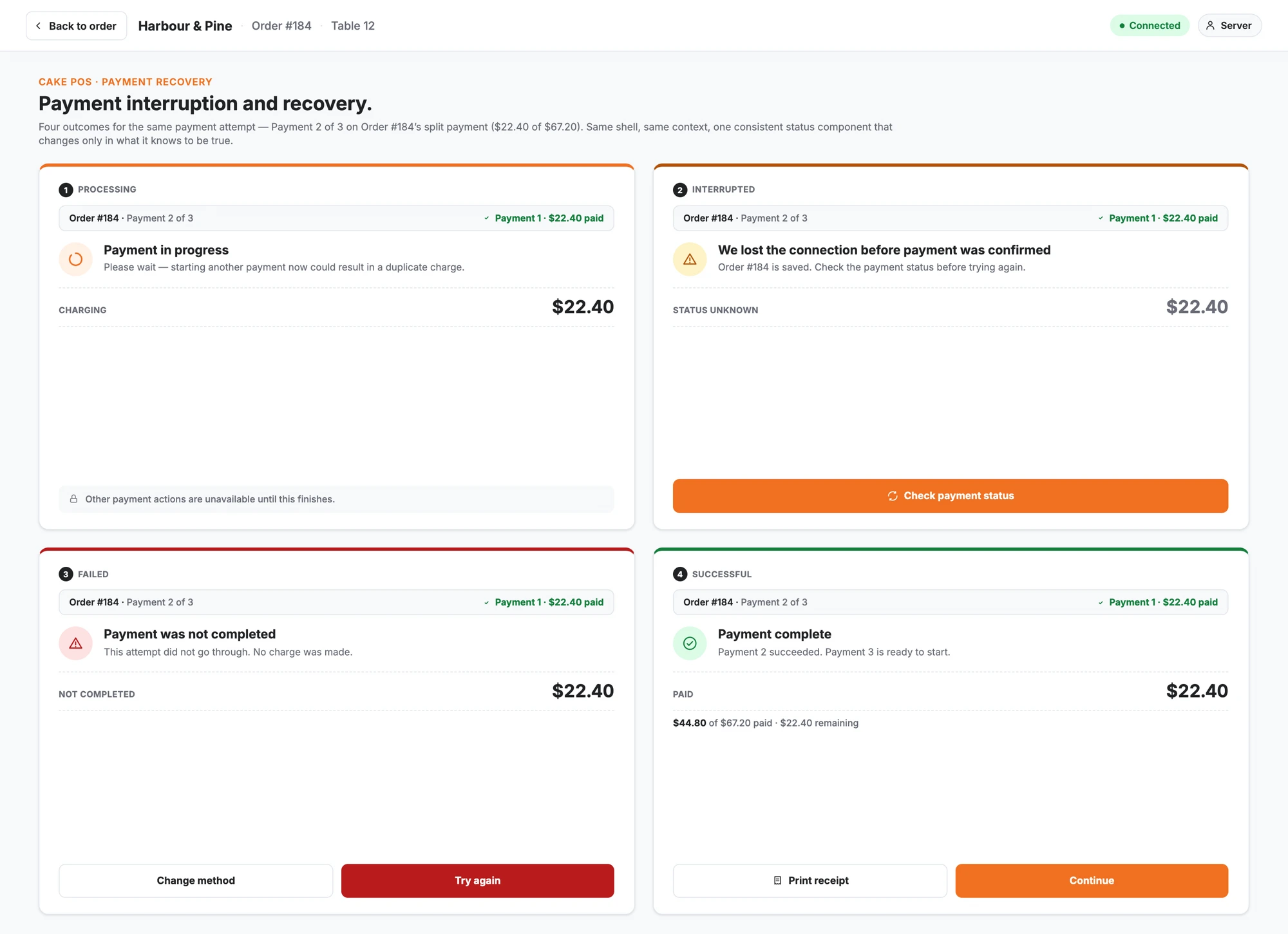
Payment recovery reused the same status model across processing, interrupted, failed and successful outcomes. The order remained available, and each state explained what the system knew and what the employee could do next.
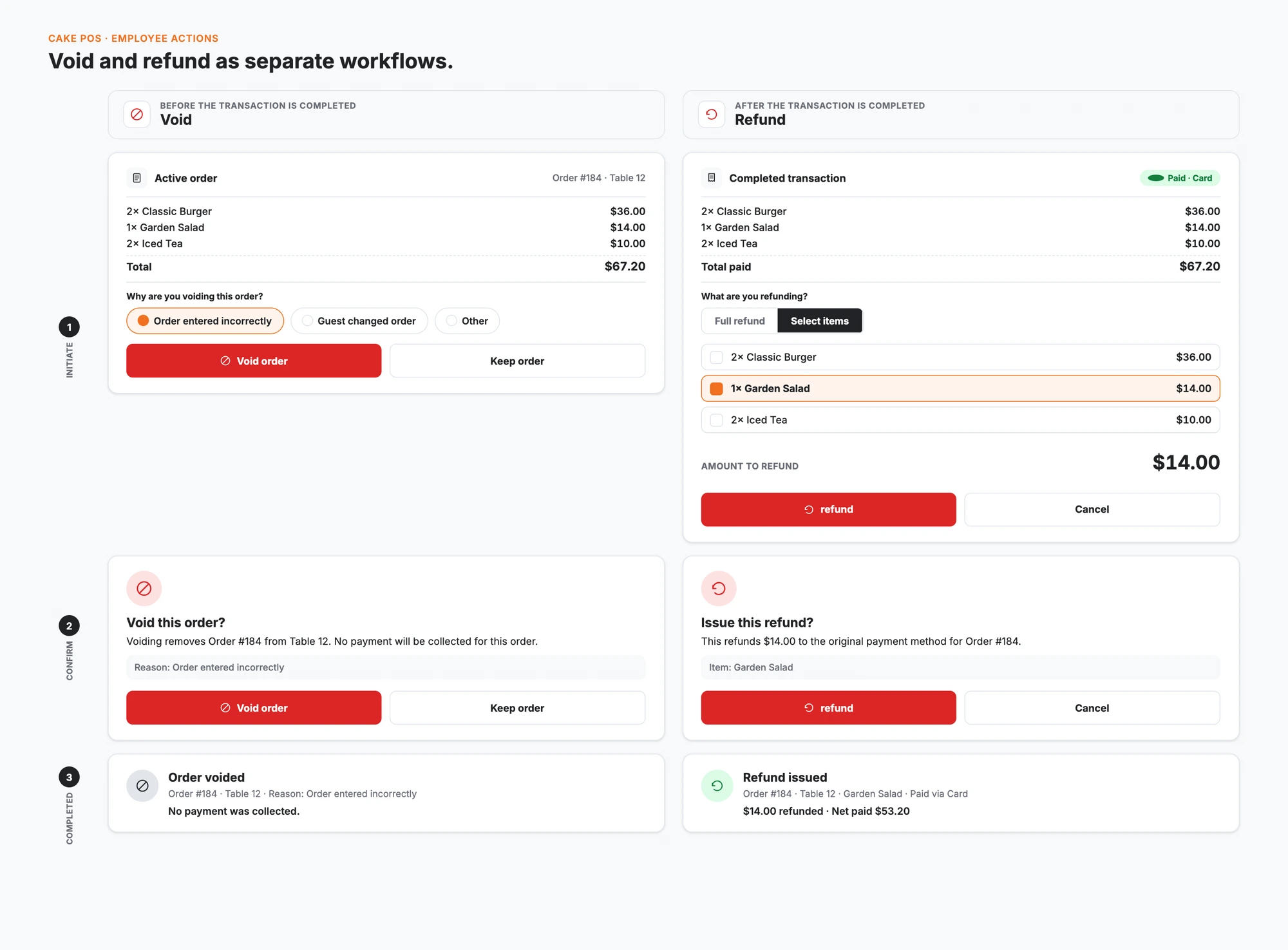
Voids and refunds were intentionally separate. A void happens before completion; a refund returns money after completion. Clear language, visible amounts and confirmation steps made the consequence understandable before the employee committed.
08 · What changed after launch
CAKE POS shipped to restaurants across the United States and Canada as a phased rollout, replacing the older employee and customer-facing screens on new deployments and platform updates rather than in a single cut-over.
Formal production metrics weren't set up against a controlled baseline, but the implementation team reported fewer support tickets involving employees leaving checkout to complete an unresolved required choice, and fewer refund-versus-void mix-ups reaching the support queue.
Trainers said new staff picked up modifier configuration and split payment without the walk-throughs older versions had needed, and having the employee screen and the customer display describe the same transaction stage cut down on cashiers explaining what the guest was seeing.
If the work continued, the next thing worth measuring would be time-to-first-competent-checkout for a new hire — a training-cost signal the redesigned flow was expected to shorten.
09 · The customer side of the same transaction
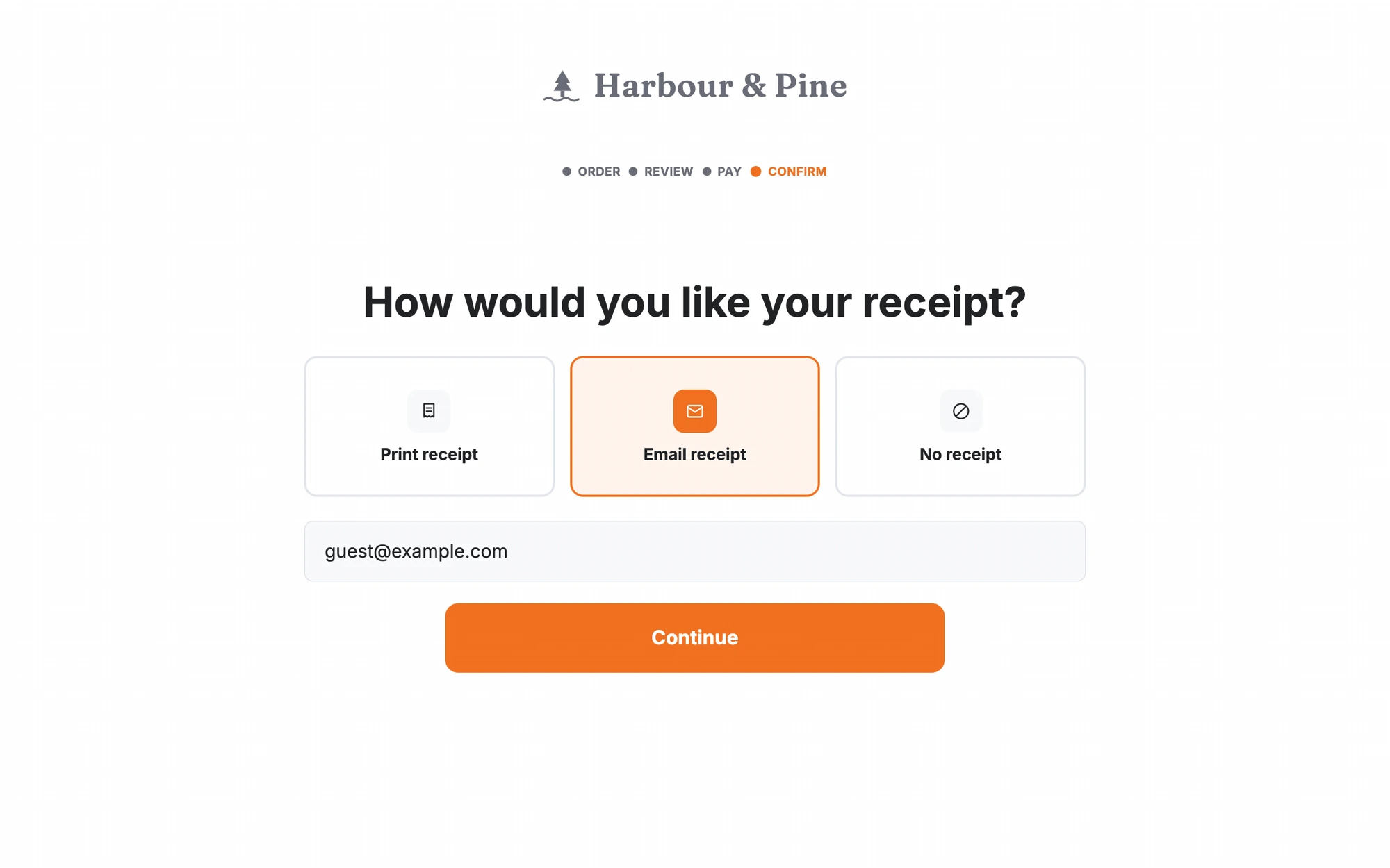
The customer display prioritized order review, tip selection, payment progress, receipt choice and confirmation. Restaurant branding remained present, but the transaction came first.
The employee and customer screens served different people, so they did not need identical layouts. They did need to describe the same transaction stage. Matching status language created a clearer handoff from review to confirmation.
10 · Turning consistency into a system
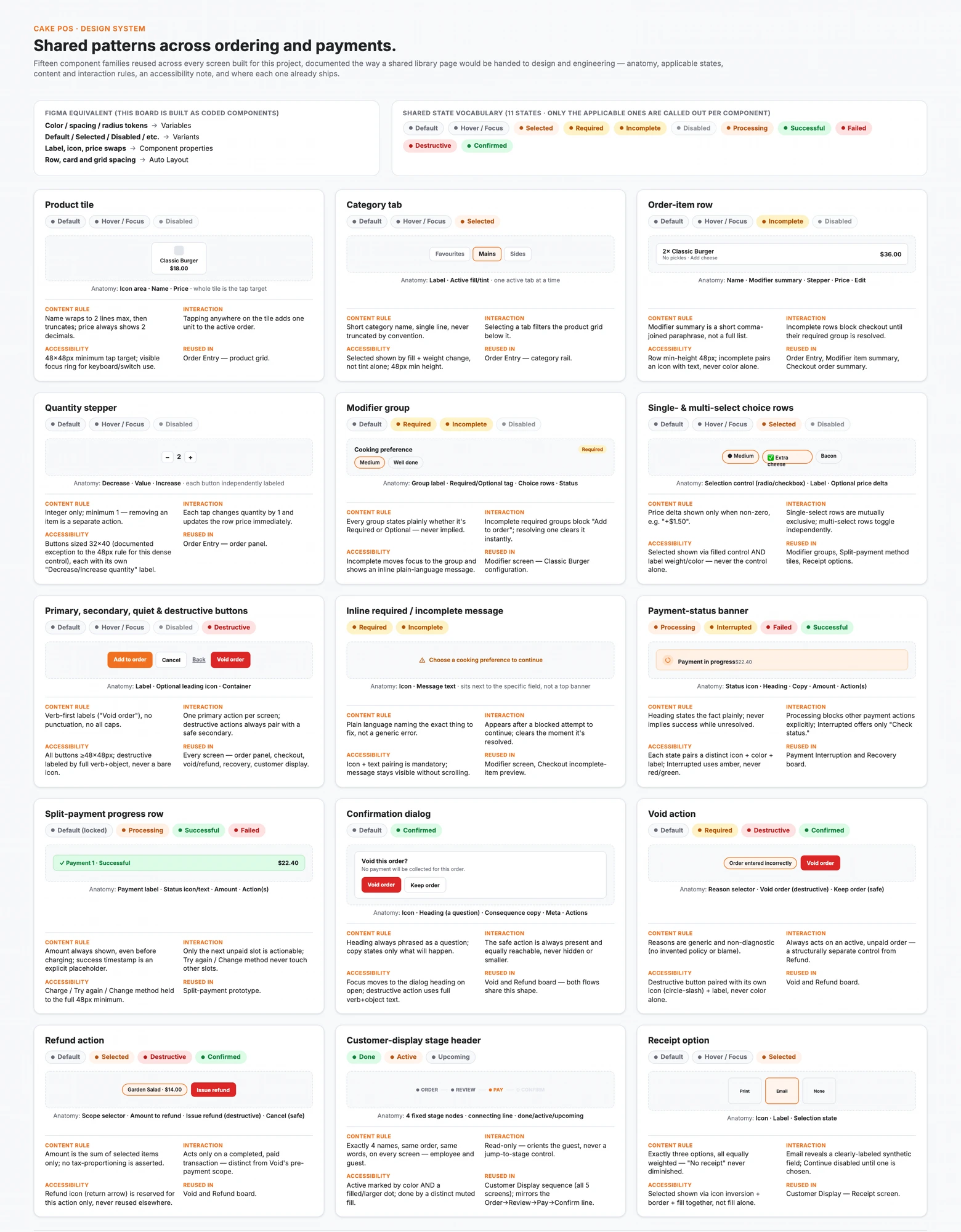
The same controls and states appeared throughout ordering and payments, but they did not always look or behave consistently. I helped turn those repeated elements into shared components and interaction rules so new work did not depend on each designer remembering an earlier decision.
The system covered order-item rows, modifier controls, actions, validation, payment status, split-payment progress, confirmation, voids, refunds and customer-display stages. The most important states were Processing, Failed and Destructive — the moments when ambiguous feedback left staff guessing.
I worked with other designers on behaviour, engineers on buildability and QA on missing states and edge cases. Engineering adopted the components, giving the team a shared reference and reducing repeated design and implementation decisions.
11 · Shipping it together
I worked with the product manager on priorities, engineers on feasibility and implementation, and QA on ordering and payment edge cases. Other designers and the design lead provided critique. Support and implementation teams kept recurring restaurant feedback connected to the work throughout delivery.
I stayed involved through implementation because a reusable component was only successful when its shipped behaviour matched the design.
12 · What I took forward
Fewer taps matter, but predictability matters just as much. During a rush, employees should not have to stop and work out how the next screen will behave.
My first instinct was to reduce taps by treating voids and refunds as one correction path. Reviews with support, QA and the wider team showed why that was risky: the actions happen at different stages and affect a transaction differently. I changed direction and separated them with clearer language and confirmation.
The strongest improvements connected the full transaction: employees moved more directly from order entry to payment, guests understood what was happening, and engineering had shared patterns for extending the product.
The project reinforced that payment workflows need more than speed. Staff and guests also need consistent status, clear recovery paths and predictable behaviour across every screen.